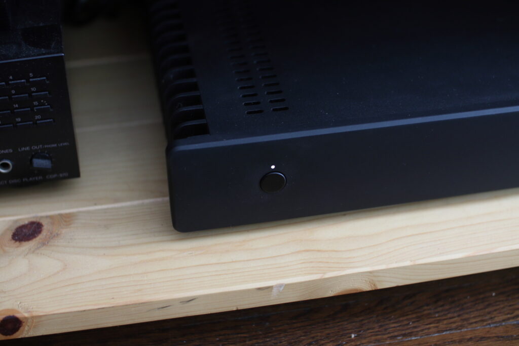
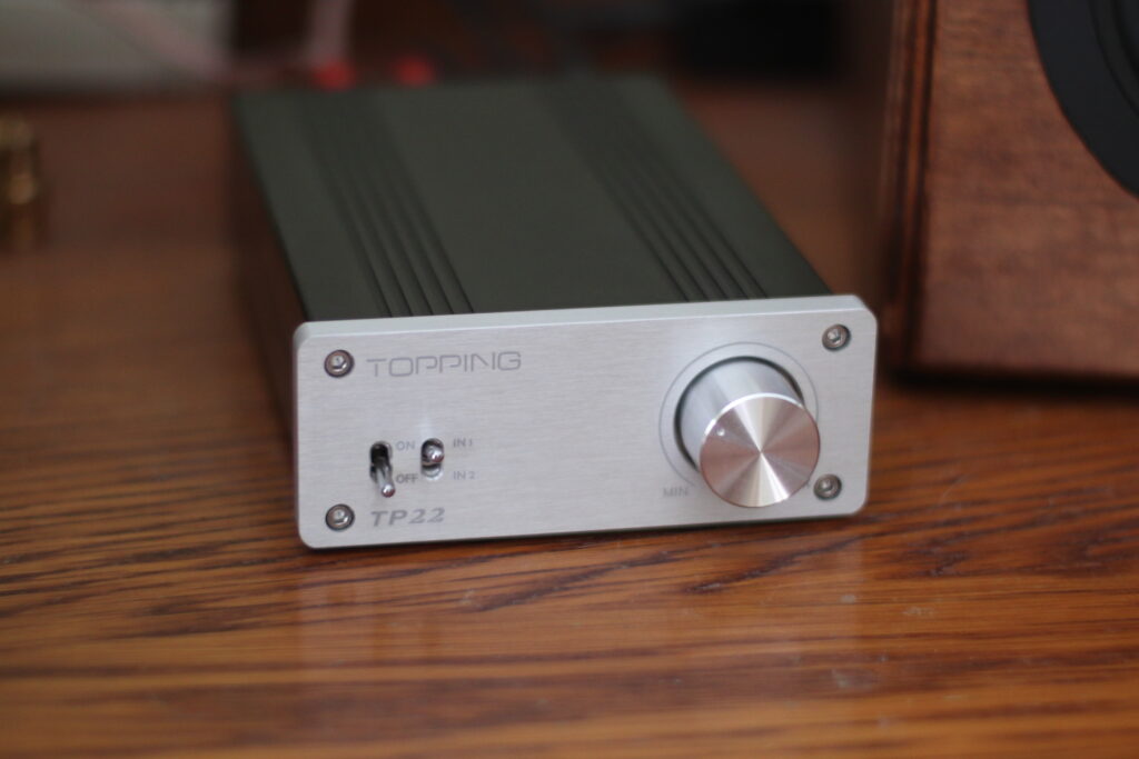
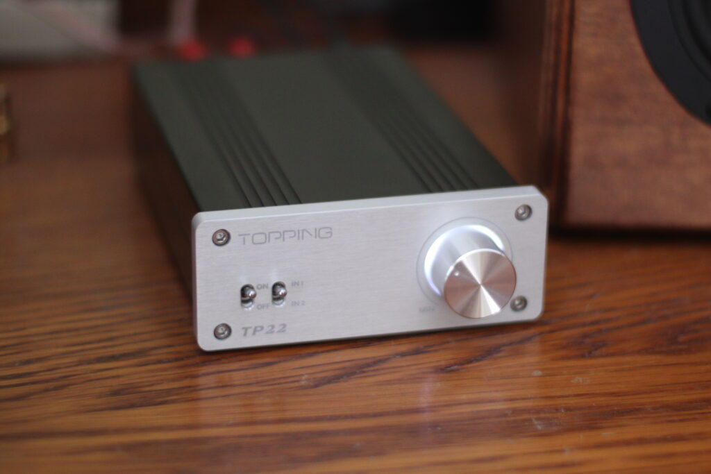
You know those bright blue LEDs that are all over consumer electronics now? Tacky, tasteless*, and bright as the blazing sun? I hate those. So I identified some of the most egregious ones in my devices, and replaced them with softer white LEDs that I had left over from an old project. And wow, what a great aesthetic improvement such a tiny change can make! Now these two items have a more neutral/grayscale tone about them, which makes them blend in to their surroundings so much better. The Topping amp looks much more Nintendo-ey, which is great because incidentally I’ve got it hooked up to my NES. And the black slab, which is my living room / entertainment PC, now matches the black-and-white theme of my main/work PC. Next up, there’s a red LED in my TV that might also benefit from becoming white to match the PC better.
*…not that blue LEDs must always look terrible. If they really do fit the theme you’re going for, then great. I’m talking about the instances where they just threw in the brightest blue LEDs without a single thought to how it would affect the aesthetic of your living space.


